
In New Jersey’s fiercely competitive marketplace—from the shorelines of Toms River to the boardrooms of Monmouth County—your website’s mobile experience can be the difference between a new lead and a lost opportunity. Imagine a prospective customer searching for “plumber near me” on their phone. Your site loads slowly, the menu buttons are too close together, and key services are buried below the fold. In those critical first seconds, you’ve already lost them to a competitor whose mobile site is swift, intuitive, and visually compelling.
Google reports that 61% of users are unlikely to return to a site if they’ve encountered mobile-access issues—and 40% will immediately seek out a rival. For NJ small businesses—whether you run a local café in Brick Township, a boutique law firm in Freehold, or an online boutique serving the Jersey Shore—that stat translates to real revenue left on the table. A mobile-first approach isn’t a luxury; it’s your frontline defense against user frustration and abandoned sessions.
This in-depth checklist is your blueprint for mastering mobile-first design. We’ll walk you through every phase: from embracing a mobile-centric mindset and optimizing performance to crafting thumb-friendly navigation and deploying rigorous testing. You’ll learn how to transform smartphones and tablets into powerful conversion engines, ensuring your WordPress website, Shopify store, or custom-built site shines on any device. Ready to give your NJ business the competitive edge? Let’s dive into the strategies that turn casual scrollers into loyal customers.

1. Embrace a Mobile-First Mindset
Before you sketch a wireframe or write a line of code, reorient your entire design philosophy around the small screen. Mobile-first isn’t just about sizing down desktop layouts—it’s about rethinking user journeys from the ground up:
- Design for Thumb-Friendly Interactions
Most users hold their phones in one hand. Position your primary navigation, “Call Now,” or “Get a Quote” buttons within the lower middle of the viewport—where thumbs naturally rest. Avoid jam-packed top nav bars that force awkward thumb stretches. - Prioritize Core Content Above the Fold
On a 6-inch screen, every pixel counts. Define the “must-see” elements—your headline, unique value proposition, and primary call-to-action—and ensure they load instantly. Secondary details, like client testimonials or blog teasers, can live further down or in expandable accordions. - Progressive Enhancement Strategy
Start with a lean, lightning-fast mobile shell: minimal scripts, compressed media, and essential functionality. Once that foundation is solid, progressively layer in desktop-specific enhancements—hover effects, multi-column layouts, and high-resolution imagery—so your desktop audience gets an enriched experience without hampering mobile speed.
Learn how our Web Design & Development services guide NJ businesses through every step of their mobile-first transformation.
By internalizing a mobile-first mindset, you not only cater to the majority of your visitors but also set the stage for robust SEO performance, seamless user experiences, and higher conversion rates.
2. Performance & Speed Optimization
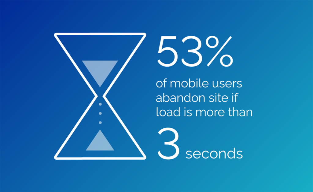
In a mobile-first world, your website’s speed isn’t a “nice to have”—it’s mission-critical. Every millisecond counts when someone is on the move, tapping through busy coffee shops or waiting for the bus. If your pages don’t appear almost instantly, potential customers hit “back” and move on—sometimes never to return. For New Jersey businesses, that lost click isn’t just a metric; it’s a lost sale, a missed appointment request, or an abandoned cart full of revenue.
Set Ambitious Speed Goals
- To lead the pack, aim for your site’s primary content—logos, headlines, hero images—to display in under one and a half seconds. Beyond that, your visitors should be able to interact—scroll, tap buttons, watch videos—in under three seconds. These targets aren’t arbitrary; they reflect real human patience thresholds. Achieving them sets you apart in Newark’s crowded digital marketplace and keeps visitors engaged from the very first tap.
Streamline Your Media
- Images and videos are often the heaviest assets on a page. By serving them in modern, highly efficient formats (think WebP or AVIF), you maintain crystal-clear visuals at a fraction of the file size. Pair that with intelligent delivery—providing smaller, screen-appropriate versions to smartphones and higher-resolution versions to tablets and desktops—and you eliminate unnecessary data transfers. Automated compression tools can then further reduce file weight without any visible loss in quality, ensuring your visuals load in a flash.
Prioritize What Matters First
- Not every resource needs to load before your user can engage. Defer nonessential scripts and media—background videos, below-the-fold galleries, social widgets—so the browser focuses on the elements that make the first impression. Meanwhile, critical assets like your main stylesheet and hero banner should be flagged for immediate loading, so your visitor sees a polished, fully styled page without delay. This “lazy loading” approach means the page feels alive almost instantly, even on less reliable connections.
Keep Your Code Lean and Mean
- Ever notice how a template site sometimes drags its feet? That’s often due to unused features and bloated code. By auditing every line of CSS and JavaScript, removing what you don’t need, and combining fragmented scripts into a few streamlined bundles, you drastically cut down the number of server requests and the volume of data each request carries. The leaner your code, the faster your pages render—transforming a sluggish browse into a satisfyingly swift experience.
Harness Smart Caching and Distribution
- Once a visitor’s browser downloads your assets, make sure it keeps them on hand for their next visit. Proper caching rules can instruct browsers to store images, fonts, and scripts for days or weeks. For returning customers, this means near-instant loading—like flipping open a well-worn book to the exact right page. On top of that, a Content Delivery Network (CDN) pushes your files to edge servers across the globe—and right here in New Jersey—so a visitor in Atlantic City isn’t pulling from a Miami data center but from one just a few miles away. The result? Blazing-fast delivery every time.
Measure, Monitor, and Refine
- Even after launch, your speed journey continues. Regular performance audits—using tools that simulate real mobile conditions—reveal new bottlenecks as you publish more content or add new features. Real-user monitoring then shows you exactly how your actual visitors experience your pages, highlighting unexpected delays or errors you can fix before they cost you business. By setting performance budgets and embedding them into your development process, you ensure that every new release maintains—or improves—your site’s speed standards.
Optimizing performance for mobile isn’t a one-off project; it’s a commitment to excellence. By making speed and responsiveness core pillars of your design and development process, you deliver experiences that delight users, improve your search rankings, and elevate every interaction—turning fleeting visitors into loyal customers across New Jersey’s dynamic digital landscape.
3. Responsive & Adaptive Layouts
A truly mobile-first site does more than shrink content into a narrow column—it dynamically adapts to every screen size, orientation, and device capability. For New Jersey businesses—from local boutiques in Asbury Park to professional services in Princeton—this means your site looks and performs flawlessly whether viewed on a 4-inch smartphone or a 13-inch Chromebook.
Flexible Grid Systems
- Fluid Containers: Design your page sections to stretch or shrink with the screen. Instead of fixed widths, let content automatically expand to fill available space.
- Proportional Columns: Arrange elements in columns that naturally wrap or stack as the viewport narrows, ensuring balanced layouts on all devices.
Strategic Breakpoints
- Logical Viewports: Identify key layout changes at natural width thresholds—for example, when two columns become cramped and need to stack.
- Orientation Awareness: Adjust layout or image presentation when users rotate their device, making the most of available screen height or width.
Content Reflow & Progressive Disclosure
- Vertical Stacking: Transform multi-column layouts into single-column stacks on narrower screens, keeping headlines, images, and calls-to-action front and center.
- Accordions & Toggles: Hide lengthy text—like detailed service descriptions or FAQs—behind expandable sections so mobile users can tap only what interests them.
Responsive Media & Graphics
- Adaptive Images: Serve appropriately sized visuals so mobile visitors download lightweight files that still look sharp.
- Scalable Icons: Use vector-based icons and graphics that retain clarity at any resolution, ensuring logos and buttons always remain crisp.
- Background Adjustments: Position background images to highlight key focal points, preventing awkward crops on different screen shapes.
Real-World Testing
- Diverse Device Pool: Test on a variety of phones and tablets—popular models in New Jersey—to uncover layout quirks you won’t see on an emulator.
- Cross-Browser Checks: Make sure your design holds up in Safari, Chrome, and other mobile browsers. Subtle differences in rendering can affect alignment, spacing, and media display.
- Accessibility Considerations: Confirm that text remains legible when users enlarge font sizes or switch to high-contrast modes.
By focusing on adaptive layouts and intuitive content flow, you deliver an experience that feels tailor-made for every visitor—whether they’re browsing on the go or relaxing at home. This level of polish and usability sets NJ businesses apart and turns first-time visitors into loyal customers.
4. Navigation & User Flows
On mobile, every tap and swipe shapes the user’s journey. Confusing menus or buried options lead to frustration—and lost customers. By designing clear, intuitive navigation and seamless user flows, you guide visitors effortlessly from first glance to final conversion.
Strategic Menu Selection
- Hamburger Menu for Depth: When your site hosts multiple service categories, case studies, and resource pages, a collapsible “hamburger” menu hides complexity until needed. Ensure the icon is universally recognized and that expanding it reveals well-organized sections, not a cluttered list.
- Bottom Tab Bar for Key Actions: If your business focuses on a handful of core actions—like “Home,” “Services,” “Book Now,” and “Contact”—a persistent bottom tab bar offers immediate access. It sits right under the thumb, perfect for quick one- or two-tap journeys.
Persistent Yet Unobtrusive Sticky Elements
- Header Bars: Keeping your logo and primary nav visible as users scroll reinforces brand identity and eases backtracking—but design them slim so they never overshadow content. Consider collapsing the header on scroll-down and revealing it on scroll-up to maximize screen real estate.
- Footer CTAs: A discreet but accessible “Get a Quote” or “Schedule Consultation” button in the footer ensures the next step is always within reach, even at the bottom of long pages.
Empower Search & Discovery
- Expandable Search: In content-rich sites—blogs, directories, or product catalogs—a magnifying-glass icon expands into a full-width search field when tapped. Include predictive suggestions and recent searches to minimize typing and accelerate discovery.
Guided Context & Return Paths
- Breadcrumb Trails: Display a simple breadcrumb path—Home > Services > SEO Audit—at the top of detail pages to orient users. This is invaluable for multi-level hierarchies like service subpages or detailed product descriptions.
- Back Navigation: Mobile browsers’ back buttons aren’t always obvious. Include on-screen back arrows or “Previous” links in complex flows such as appointment booking or e-commerce checkouts to reduce user anxiety and cart abandonment.
By sculpting navigation and flows that anticipate user needs—prioritizing ease of access, discoverability, and context—you transform clicks into intuitive journeys that end in conversions rather than exits.

5. Touch-Friendly Controls
On mobile devices, every interactive element must feel natural under the user’s fingertip. Oversized buttons, cramped links, or unresponsive taps erode trust and drive users away. Designing with touch in mind ensures fluid, frustration-free engagement.
Ideal Tap Targets & Spacing
- Generous Button Sizes: Aim for at least 44×44 pixels per tap target. This size balances screen space with ease of use—big enough to hit confidently, yet compact enough to allow multiple options on screen.
- Comfortable Margins: Surround each interactive element with 8–10 pixels of padding or margin. This buffer prevents accidental taps on adjacent buttons, links, or form fields and gives the interface a breathable, uncluttered feel.
Immediate Visual Feedback
- Active States: When a user taps a button or link, provide instant visual confirmation—a subtle color change, a brief animation, or a soft shadow—to signal that the action registered. This feedback loop feels responsive and builds confidence.
- Focus Indicators: For users navigating via external keyboards or accessibility tools, ensure focus outlines or highlights appear clearly on the tapped element.
Mobile-Optimized Form Components
- Smart Input Types: Deploy native input types for phone numbers, email addresses, and calendars—triggering context-appropriate keyboards and pickers. This minimizes typing errors and accelerates form completion.
- Auto-Complete & Suggestions: Enable browser auto-complete for common fields like name and address. Offer inline suggestions where possible—such as location auto-complete using Google Places—to speed up multi-step forms.
- Progressive Validation: Validate each field on blur rather than waiting for the full form submission. Instant error messages (“Please enter a valid email”) guide users immediately, reducing frustration and abandonment.
By prioritizing touch ergonomics, you turn every tap into a deliberate, satisfying interaction—removing friction, enhancing accessibility, and ultimately driving higher engagement and conversion rates across your mobile site.
6. Content & Typography: Crafting Clarity and Impact
On mobile screens, every word counts. Your text must be effortlessly readable and strategically structured to guide readers toward action—whether they’re browsing on a 4-inch phone or a larger tablet. Here’s how to elevate your mobile copy and typography for maximum impact:
- Optimal Font Sizing & Hierarchy
Start with a base font size of at least 16px for body text. This size ensures legibility without zooming. Pair it with a line-height of 1.4–1.6 to give lines room to breathe. Then establish a clear typographic hierarchy:- Headings: Use bold, distinctive fonts for H1 and H2 to draw attention to key sections.
- Subheadings: Employ a slightly smaller size or weight for H3 and H4 to break up content.
- Captions & Labels: Keep these concise and no smaller than 14px to remain readable on smaller devices.
- Accessible Contrast & Color
Adhere to a contrast ratio of at least 4.5:1 between text and background for body copy and 3:1 for large headings. This not only meets WCAG accessibility standards but also ensures text stands out in bright outdoor conditions—critical for on-the-go mobile users. - Concise, Scannable Content
Mobile readers often skim. Structure your copy into bite-sized paragraphs (2–3 lines max) and use bullet lists or numbered steps for clarity. Highlight key phrases with bold or color accents to allow eyes to zero in on essential takeaways—like service benefits or unique value propositions. - Progressive Disclosure for Depth
When detailed information is necessary—such as pricing tables or case study insights—employ “Read More” toggles or accordion sections. This keeps pages clean and scannable while giving interested users access to deeper content without overwhelming everyone.
Discover our Content Creation services for mobile-optimized copy that resonates with your audience and drives conversions.
7. Mobile SEO & Visibility: Be Found First
A stunning mobile site is only valuable if people can discover it. Mobile SEO ensures your business appears at the top of local and organic search results—capturing customers exactly when they’re seeking your services in New Jersey.
- Responsive Design as the Foundation
Favor responsive web design over separate mobile URLs or dynamic serving. This unified approach prevents duplicate content issues and simplifies maintenance—ensuring Google indexes the same URL for all devices. - Local Business Markup
Implement Local Business schema to provide search engines with structured details: business name, address (NAP), phone, hours, and geolocation. Enhanced results—like Google’s local “pack” listings—boost visibility for searches like “Toms River web design” or “Monmouth County SEO.” - Mobile-Optimized Meta Tags & Social Previews
Craft concise, compelling meta titles and descriptions that include local keywords (e.g., “NJ Custom Web Development”). Ensure Open Graph tags (OG:title, OG:description, OG:image) are set for social sharing, so every post looks professional on Facebook, LinkedIn, and messaging apps. - Page Experience as a Ranking Signal
Google’s Mobile Page Experience update factors in Core Web Vitals—Largest Contentful Paint, First Input Delay, Cumulative Layout Shift—alongside mobile usability. Optimizing for these metrics not only improves UX but also boosts search rankings, driving more qualified traffic to your site.
Learn more about our SEO services to ensure your mobile-first site ranks at the top in New Jersey and beyond.

8. Conversion Optimization: Turning Visitors into Customers
Designing for mobile isn’t just about looks and speed—it’s about seamless pathways to action. Your mobile site must remove friction and inspire confidence at every touchpoint, turning casual browsers into loyal customers.
- Instant Contact Options
Embed tel: and mailto: links on phone numbers and email addresses. A single tap should dial your office or open the user’s email client—eliminating tedious copy-and-paste steps. - Persistent, Contextual CTAs
Use sticky call-to-action banners—for example, “Request a Quote” or “Book Your Consultation”—that follow users as they scroll. Adjust the CTA copy based on page context: service pages might offer a free audit, while blog posts prompt newsletter sign-ups. - Streamlined, Adaptive Forms
Limit initial forms to the essentials—name, contact info, and a brief message. For detailed inquiries, break forms into progressive steps, loading each section only after the previous is complete. This reduces cognitive load and improves completion rates on small screens. - Trust Signals & Social Proof
Mobile visitors crave reassurance. Display trust badges (secure checkout logos, industry certifications) and Google Reviews snapshots above the fold. Incorporate client testimonials in carousels or quick-read quotes—underscoring your credibility before users commit. - A/B Testing for Continuous Improvement
Run mobile-specific A/B tests on button colors, CTA placement, and form lengths. Tools like Google Optimize or VWO let you fine-tune elements based on real user behavior, ensuring your site evolves to deliver ever-better conversion rates.
By weaving these conversion best practices into your mobile-first design, you craft an experience that not only attracts visitors but compels them to act—maximizing returns for NJ businesses of every size.
9. Rigorous Testing & Quality Assurance
A flawless mobile experience demands exhaustive testing—catching subtle issues before they reach real users. Our multi-layered QA process combines automated tools, real-device checks, and human insights to ensure your site performs impeccably across New Jersey’s diverse mobile landscape.
Cross-Platform & Device Validation
- Physical Device Farm: Beyond emulators, we test on a curated selection of real smartphones and tablets—iPhones (all current iOS versions), popular Android handsets from Samsung, Google Pixel, and OnePlus, plus tablets like the iPad Mini and Galaxy Tab. This hands-on approach reveals performance quirks that virtual tools can miss.
- Browser Matrix Testing: We verify consistent functionality in mobile browsers—Safari on iOS, Chrome on Android, Samsung Internet, and Firefox Focus. Each engine renders CSS and JavaScript differently; true QA ensures your navigation, forms, and media behave identically everywhere.
Automated Performance & Accessibility Checks
- Regression Audits: Every time new code is merged, our CI pipeline runs automated audits using Lighthouse and WebPageTest. We compare key metrics—First Contentful Paint, Speed Index, and Accessibility scores—against baseline thresholds. Any regression triggers an alert, prompting immediate remediation before deployment.
- Accessibility Scanning: Automated tools (e.g., axe-core) scan for contrast issues, missing alt text, and keyboard navigation barriers. Combined with manual keyboard and screen-reader testing, this process guarantees your site serves all users—including those with disabilities—while aligning with New Jersey’s ADA requirements.
Human-Centered Usability Testing
- Task-Based Sessions: We recruit 5–10 representative users—local business owners or customers—to perform key tasks on your mobile site: finding service details, submitting a contact form, or completing a purchase. Observing their interactions uncovers unexpected pain points, unclear labels, or hidden roadblocks.
- Heatmaps & Session Recordings: Tools like Hotjar reveal where users tap, scroll, or abandon pages. If critical CTAs go unnoticed or users repeatedly backtrack, we refine layouts and labels to streamline their journey.
- Iterative Feedback Loops: Post-launch feedback sessions with your team and select clients ensure any nuance—like preferred menu labels or landing-page flow adjustments—is incorporated swiftly, elevating the final experience.

10. Ongoing Maintenance & Proactive Monitoring
Launch is just the beginning. To sustain peak performance and security, your mobile-first site requires a vigilant, ongoing maintenance regimen—one that evolves with new devices, browser updates, and content needs.
Structured Update Cycles
- Staging Environment Protocol: All CMS core, plugin, and theme updates are first applied in a secure staging environment. We run full regression tests—functional, visual, and performance—to catch conflicts or regressions before any live changes.
- Scheduled Maintenance Windows: Quarterly maintenance windows allow for comprehensive updates, plus time for targeted improvements such as new landing-page modules or performance fine-tuning.
Continuous Performance Audits
- Core Web Vitals Tracking: Each quarter, we review your site’s Largest Contentful Paint, First Input Delay, and Cumulative Layout Shift—ensuring your mobile experience remains fast and stable as you add new content or features.
- Benchmark Comparisons: We benchmark against previous audit results and industry standards, setting new performance goals to keep you ahead of local competitors.
Robust Security Scanning
- Automated Vulnerability Alerts: Tools like Sucuri monitor in real time for malware, unauthorized file changes, and known exploits. Immediate alerts allow us to quarantine threats before they compromise user data or site integrity.
- SSL & Certificate Management: We oversee certificate renewals and enforce HTTPS site-wide, safeguarding every form submission and login.
Dynamic Content Refreshes
- SEO-Driven Updates: Regularly refreshing service descriptions, testimonials, and blog posts with local keywords (e.g., “Toms River NJ web design,” “Monmouth County digital marketing”) maintains search relevance and signals freshness to Google.
- Seasonal & Promotional Tweaks: Whether you’re launching a summer special or holiday sale, we quickly roll out mobile-optimized banners, pop-ups, and landing pages—keeping your offers front and center.
Explore our Website Maintenance services to keep your mobile-first site healthy, secure, and performance-tuned year-round.

Ready to Dominate Mobile in New Jersey?
In New Jersey’s fast-paced, on-the-go digital landscape, a mobile-first website isn’t optional—it’s your front-line opportunity to engage, convert, and retain customers. By rigorously testing across real devices, automating performance and accessibility checks, and committing to proactive maintenance, you deliver an experience that:
- Loads in the blink of an eye, even on congested networks
- Guides users with crystal-clear navigation and ergonomic controls
- Showcases your brand’s unique story, from Toms River boutiques to Monmouth County service firms
- Converts visitors with optimized calls-to-action, forms, and trust signals
- Ranks prominently in local and organic search through tailored mobile SEO
Whether you’re launching a lean three-page brochure site or scaling into a feature-rich e-commerce platform, VINIO Marketing stands ready to be your partner. Contact us today for a complimentary mobile UX audit, and discover how our custom web development and WordPress Websites services can propel your NJ business—one seamless tap at a time.